Visual Identity for Tsokotsa

logo_jam tsokotsa


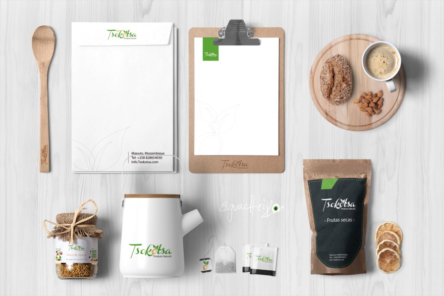
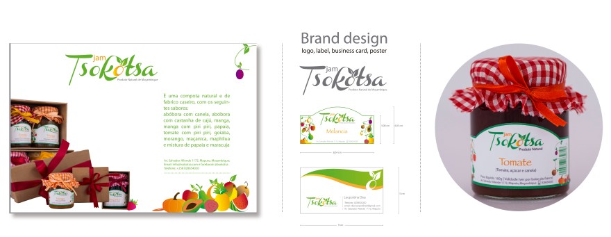
Tsokotsa is a mozambican organic food brand. When we were conceptualizing the brand we wanted to keep a few important aspects highlighted: fresh, organic and the use of fruits. The colors were chosen to represent nature and natural products, and the letter ‘o’ resembles an Orange because it is one of the primary ingredients used in Tsokotsa’s Jams, Dried Fruit, etc.


Food Packaging-tsokotsa1Coffee Bag and CupBrand design: Jam Tsokotsa


roll-up_tsokotsa_web.jpg

Leave a Reply

Fill in your details below or click an icon to log in:

WordPress.com Logo

You are commenting using your WordPress.com account. Log Out /  Change )

Facebook photo

You are commenting using your Facebook account. Log Out /  Change )

Connecting to %s