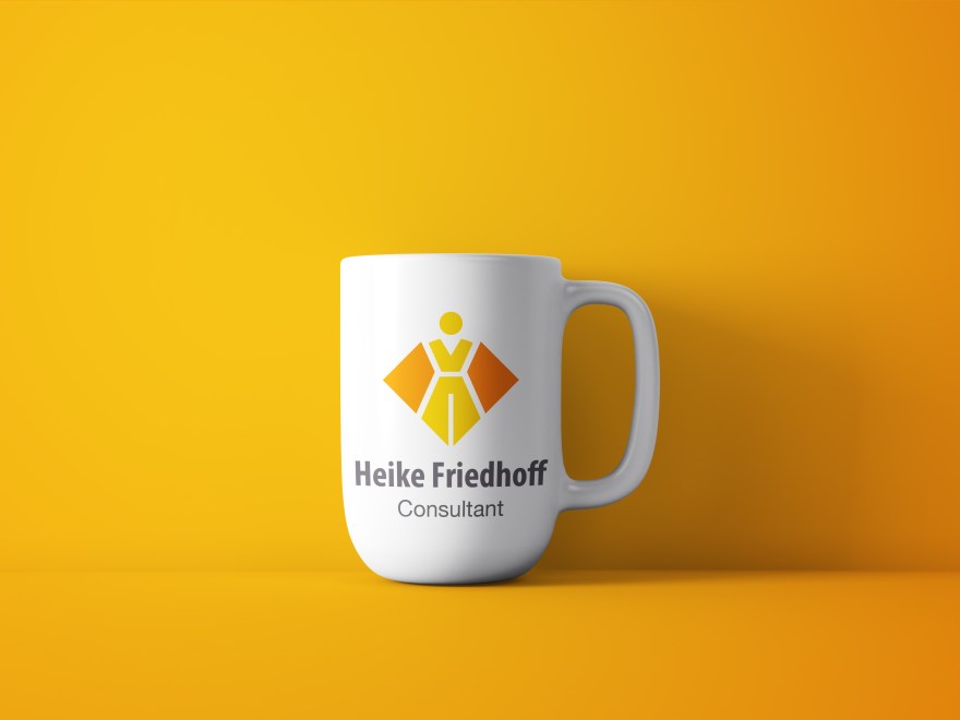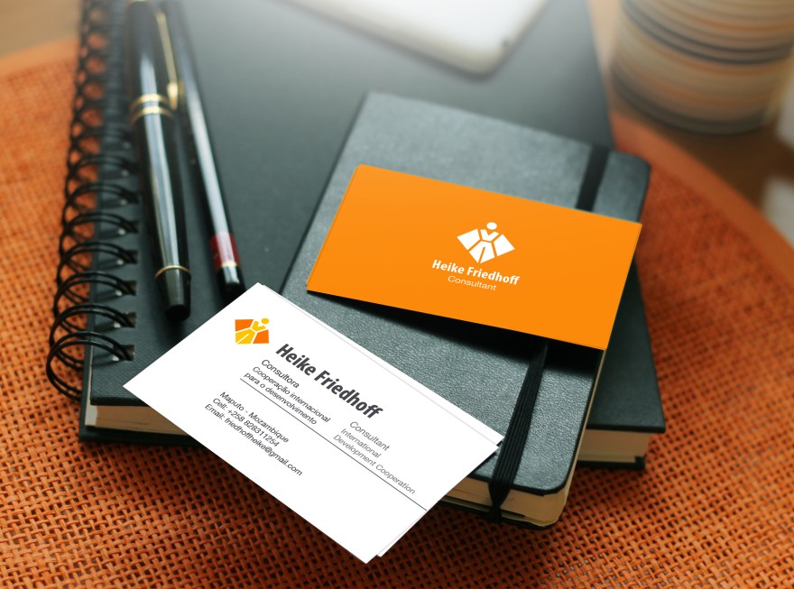
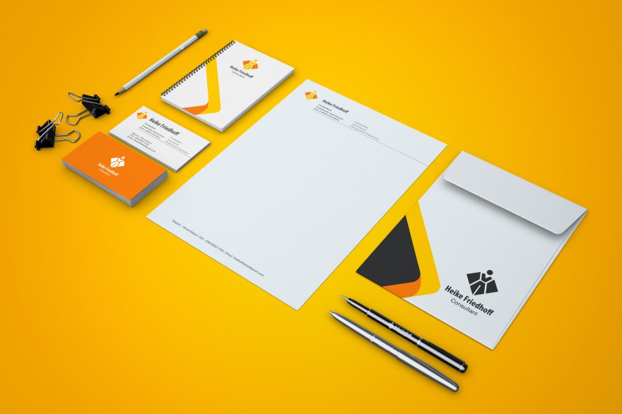
When developing the logo and visual identity for consultant Heike Friedhoff we wanted the visuals to really reflect her work. An important feature to highlight was her focus on gender equality. To show this, in the center of the design is a female character, wearing trousers (as opposed to the traditional skirt symbol). The lower part of the figure also resembles the tip of a fountain pen, a key tool in the work of a consultant.
The overall shape of the logo resembles a triangle or diamond. These shapes represent qualities like clarity, and wisdom, all important for a consultant.
The chosen color palette is fresh, positive and inviting.
![]()

![]()
![]()